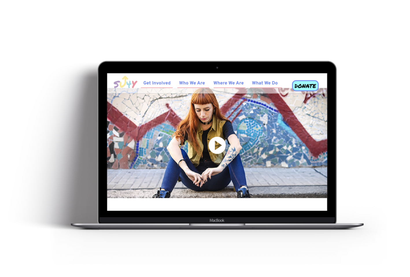
Standupforkids Redesign
Redesign the website, http://www.standupforkids.org/. We want to make the website both easy for youth to locate how they can get help as well as make it easy for volunteers to sign up. The appearance of the website should portray that this organization will provide a safe and comfortable place for youth to get the services they desperately need, to be a haven for homeless youth, and that the volunteers are making a great impact.
Concept
We believe our organization's website was designed to achieve ending the cycle of youth homelessness and create easily accessible ways for both volunteers to donate their time and for donors to provide funding. We have observed our website isn't gaining the necessary exposure, donations aren't coming through as much as we need, and that the website is causing misconceptions and confusion and this has caused a difficulty in volunteer retention. We might improve our website and mission by making call to action buttons more prominent, showing off what the organization does and how it benefits youth, showing visualizations that trigger more emotion, including more youthful graphics and colors to branding, redesign of logo to be more contemporary, and describing what donations go to and describing how to volunteer. We will know we have improved these items when our donations go up by 25%, volunteer retention goes up by 50%, and we see a 10% reduction in homeless youth.

Problem
©2022 BUSRA KIRALP


